Content Upgrade Email Signup Page That Converts
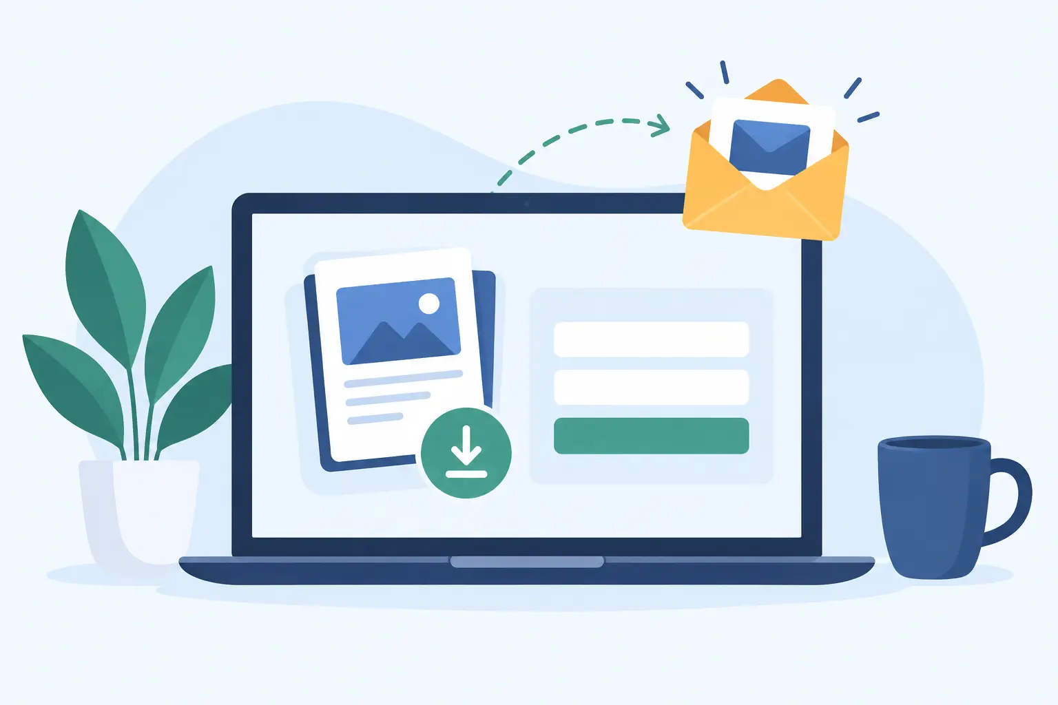
A content upgrade email signup page should do one job: turn a moment of interest into a contact you can reach again. Someone watches your video, reads your post, or saves your thread. Instead of hoping they remember your name later, give them one useful next step.
That does not require a funnel map, a dozen form fields, or a delivery system held together by automations. It requires a specific resource, a clear page, and a link placed where attention already exists.
What a content upgrade actually is
A content upgrade is a small resource that extends a piece of content. It helps people act on what they just learned. A YouTube video about pricing can lead to a pricing calculator. A post about meal prep can lead to a grocery template. A consultant's article on client onboarding can lead to an onboarding checklist.
The best upgrades are not generic giveaways. “Subscribe for updates” asks for trust before offering much value. A useful companion resource makes a simpler exchange: you found this content helpful, so here is the practical version you can use.
Specificity matters. The upgrade should match the topic, stage, and promise of the content that sends people to it. If your video teaches creators how to plan a newsletter, offer a newsletter planning sheet. Do not send them to a broad library of unrelated downloads. Relevance reduces the decision required to sign up.
There is a trade-off. A highly tailored upgrade usually converts better than a broad one, but it takes more effort to create. If you publish often, start with one durable resource that supports your best-performing topic. Improve the match later when you know where attention is coming from.
Build the content upgrade email signup page around one outcome
A strong page is not a miniature website. It is a focused handoff between content and contact collection. The visitor should understand what they get, why it helps, and what happens after they enter their email.
Start with the outcome, not the format. “Get the 10-minute client onboarding checklist” is clearer than “Download my PDF.” People want a result. The PDF, template, swipe file, or guide is simply the container.
Your headline should name the resource and its payoff in plain language. Support it with a short sentence that explains who it is for or what problem it removes. For example: “Plan four weeks of newsletter ideas without staring at a blank page.” That is more useful than claiming it will transform someone’s business.
A cover image or preview helps when the resource is visual. Show the worksheet, checklist, template, or collection in a clean format. Do not make the visitor guess whether the download is substantial. At the same time, do not bury the form under decorative graphics. The resource is the reason they arrived.
Keep the form light. An email address is often enough. Asking for a first name can make sense if you will use it, but every extra field adds friction. Asking for a company size, budget, role, phone number, and favorite color before delivering a one-page checklist is not qualification. It is a reason to leave.
The button should complete the action. “Send me the checklist” is clearer than “Submit.” Use a direct label that reinforces what happens next.
State the exchange clearly
People are comfortable sharing an email when the value and expectations are obvious. Tell them they will receive the resource and, if relevant, occasional emails related to the topic. Keep that language brief and honest.
Do not hide a hard sales sequence behind a free template. You can sell later, but the first interaction should deliver exactly what the page promised. This is how a list becomes an audience instead of a pile of addresses that never opens another email.
Write an upgrade people can use today
The fastest way to create a weak lead magnet is to turn an old blog post into a long document and call it exclusive. Length is not value. Utility is.
Choose a resource that removes work. Checklists, scripts, calculators, templates, examples, prompt packs, curated tool lists, and decision frameworks work because they help people move faster. They make the original content easier to apply.
A good upgrade is often smaller than creators expect. A one-page checklist can beat a 40-page guide if the checklist gets used. Your audience is busy. Give them something they can open, understand, and put to work in a few minutes.
Use this test before publishing: would someone feel they gained something even if they never hear from you again? If the answer is no, make the resource more concrete. Add the template, examples, steps, or source material that makes it worth saving.
For educators and coaches, this might be a lesson planner or reflection worksheet. For consultants, it could be a discovery-call question bank. For newsletter operators, it may be a subject-line library built from proven patterns. For lean marketing teams, it could be a campaign brief that stops the usual back-and-forth.
Publish where attention already exists
The page itself does not create demand. Distribution does. Put the signup link beside the content that created the need for it.
Add it to the description of the video that inspired the resource. Mention it in the final minute of the video. Include it in a pinned comment when that fits the platform. Place it in your social bio if it is your main offer, or use it in the post that covers the same subject. Add it to relevant newsletter issues, podcast show notes, community posts, and replies where people ask for the next step.
The message should stay close to the original promise. If you taught three ways to improve client proposals, say: “I made the proposal review checklist mentioned here. Get it at the link.” No manufactured urgency required.
Consistency matters more than a huge launch. A useful upgrade linked from ten relevant pieces of content can quietly collect leads for months. One announcement to a cold audience may generate a spike, then disappear.
Make delivery boring on purpose
Delivery should be immediate. A person signs up, gets access, and moves on with their day. If they have to wait for a manual reply or search through a cluttered email sequence, you have added friction after they already said yes.
This is where many creators overbuild. They assemble a landing page, connect a form, set up an email provider, upload a file, configure tags, test automation rules, and troubleshoot delivery. The tool stack becomes the project.
For a straightforward resource, the workflow can be much simpler: write the resource page, publish the link, and collect the email addresses. Sublead.io is built around that path. It lets you create a resource page with supporting materials, share one link, and export collected contacts as a CSV when you need them.
That simplicity is not a limitation for every case. It is the right constraint when your goal is to publish useful resources quickly. If you need complex segmentation, branching sales sequences, or enterprise routing, a larger system may be justified. But do not install enterprise machinery just to deliver a checklist.
Measure the right signals
A signup count tells you something, but not everything. Look at the relationship between the content, the page, and the people who join.
If many people see the original content but few sign up, the offer may be too broad, too hidden, or not useful enough. Tighten the match. Make the resource more tangible. Put the call to action closer to the moment of interest.
If the page gets visits but few completions, simplify the headline and form. Check whether the page explains the benefit before asking for the email. Remove distractions. A visitor should not need to scroll through your life story to understand a checklist.
If people sign up but do not engage afterward, the issue may be audience intent. The resource may attract curiosity rather than the problem you actually solve. That is not always bad. A broad resource can grow your list. But if you sell a focused service, create upgrades that attract people closer to that need.
You do not need perfect attribution to make progress. Track where you share the link, notice which topics bring qualified replies or customers, and create more resources around those subjects. Your best upgrade is usually hiding inside the content your audience already responds to.
A page does not need to feel like a funnel to collect leads. Make one useful thing. Put it next to the content that makes people want it. Then keep publishing.